Microsoft | Virtual Appointments at Teams
Background
The COVID-19 pandemic in 2020 created an urgent demand for remote healthcare solutions as in-person visits became risky and often inaccessible.
In late 2021, our team launched Virtual Appointments, an end-to-end solution that enables organizations to seamlessly manage and conduct B2C virtual meetings.
As a premium service within Microsoft Teams, Virtual Appointments helped drive adoption of Teams Premium licenses, extend Teams' market presence beyond B2B meetings, and strengthen Microsoft’s footprint in healthcare, financial services, and retail. Between late 2020 and early 2022, Microsoft Teams' monthly usage surged by over 560%.

The Prroduct
Virtual Appointments — an end-to-end platform for B2C engagement through Microsoft Teams
Virtual Appointments in Microsoft Teams serves as a central hub for managing business-to-customer (B2C) virtual engagements. It delivers a seamless end-to-end experience, allowing organizations to schedule, manage, and analyze customer appointments in a single integrated app.

our customers
My focus areas

For patients / attendees
E2E patients experiences
Designed for the entire virtual appointment journey, including booking, pre-visit reminder, joining flow, device testing, waiting room, live appointment, and post-visit flow.

For it admins
EHR connectors
Integrate Teams into clinical workflows, enhancing efficiency for providers and IT admins.

For schedulers & providers
Virtual lobby chat
Enable schedulers & providers chat with patients waiting in the virtual waiting room

case study
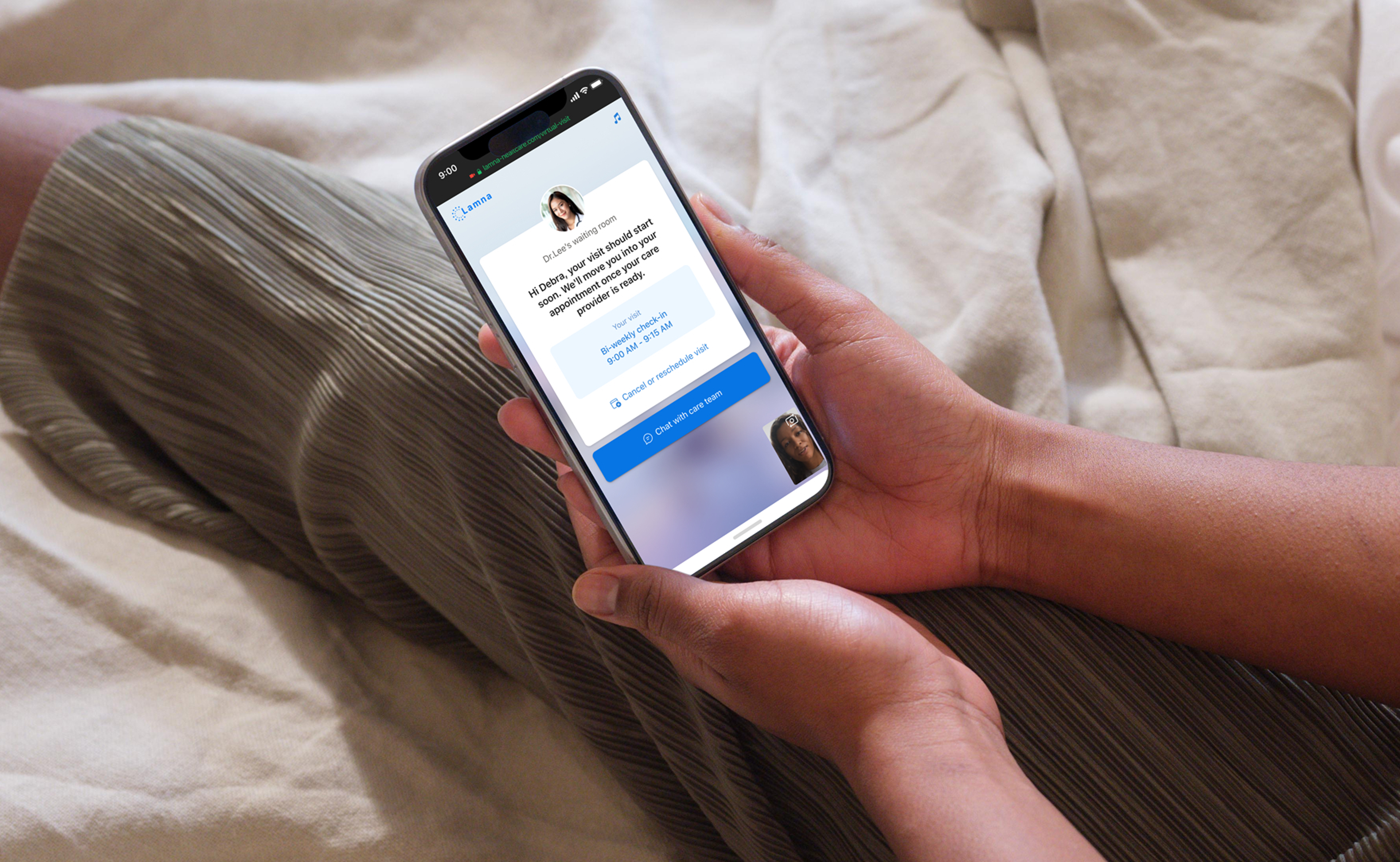
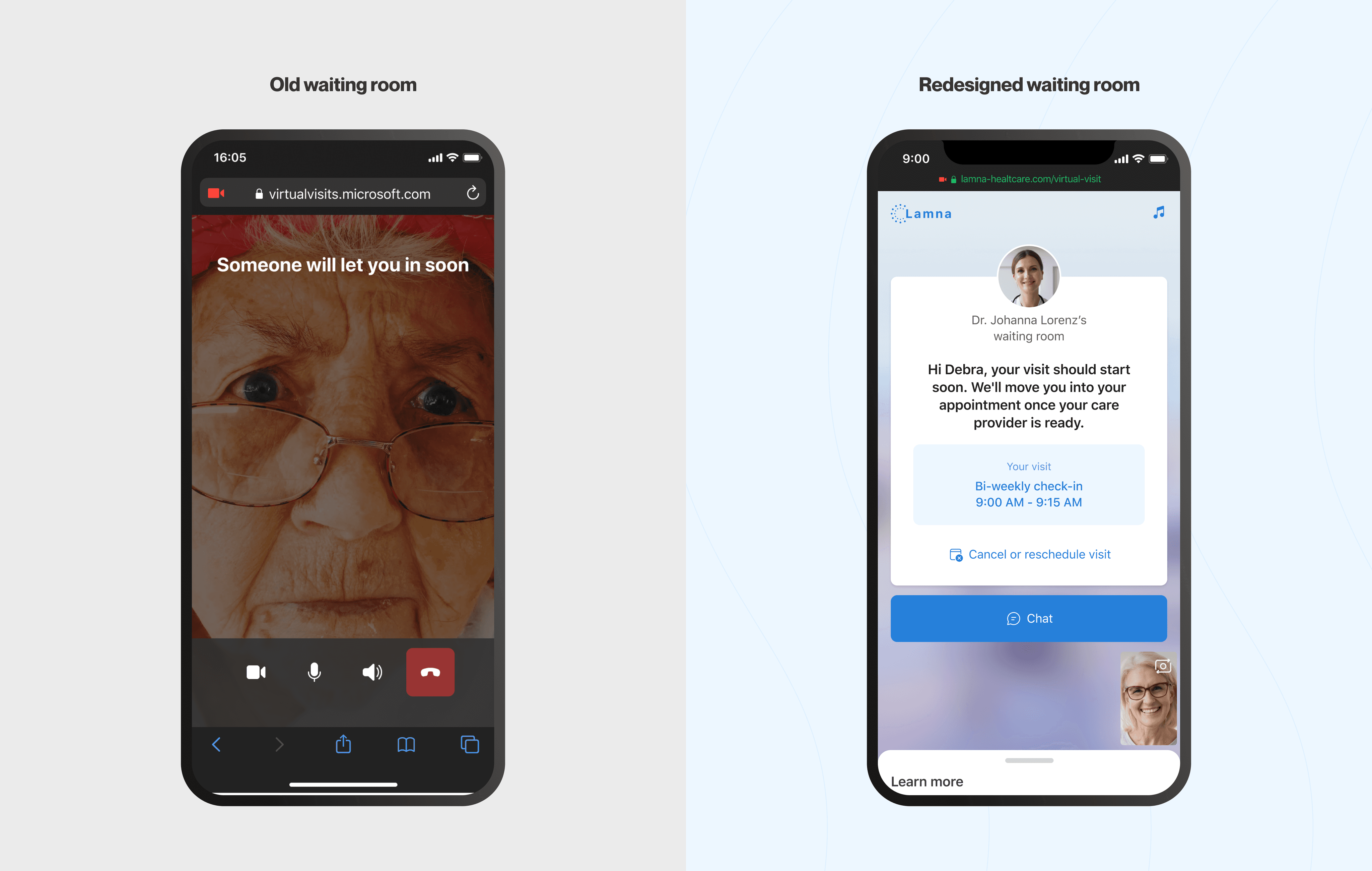
Virtual Waiting Room
This is an interim space patients land before healthcare providers enters Teams meeting.
I redesigned Teams’ virtual waiting room to help clinics provide a branded, personalized and accessible virtual visit experience to their patients, eventually making telehealth more accessible, reducing no-show rates, and saving providers' time.

Old waiting room
My Role
Lead UX designer, user research, end-to-end flows, usability test, vision design
My Crew
1 PM, 1 content designer, 1 researcher, 5 engineers
Timeline
Private release: Jan - Oct 202
GA release: Oct 2021 - Jan 2022
Platform
Mobile first, responsive to tablet and desktop
Outcome
Impcats
Who are our users
Users in virtual healthcare workflow
Our users span administrators, schedulers, service providers, and attendees across various industries. In healthcare, nurse practitioners, physician assistants, registered nurses and even back-office assistants might also be involved in the workflow.

Virtual Healthcare appointment workflow

The Problem
High No-Show Rates, Missed Appointments, and Poor Attendee Experience
In late 2020, healthcare customers faced high no-show rates when using generic Teams meetings, as many patients struggled with setting up and joining meetings easily and quickly.
What did customers say
“…almost 1/3 patients can’t login and end up calling call center for help while meeting time passed…”
Scheduler from Kaiser Permanente
"… many (appointments) ended up happening more over the telephone right now, just because it's harder to get that Teams meeting quickly set up."
Director of Strategic Planning at NYPCC
Why it matters?
A frictionless attendees experience is not only beneficial to patients, making healthcare accessible, it's also critical for both customers and Microsoft.
For patients
✅
More accessible to better healthcare services
For healthcare customers
✅
Crucial for telehealth adoption and transformation
✅
Improve quality of care and reduce no-show rate
For Microsoft
✅
Drive adoption and usage for Virtual Appointments and Teams
✅
Scalable across industries to extend Microsoft's market presence
⚠️
Risk of customers loss if attendee experience is poor
Problem statement
Understanding users
Anyone can be patients, especially those in need
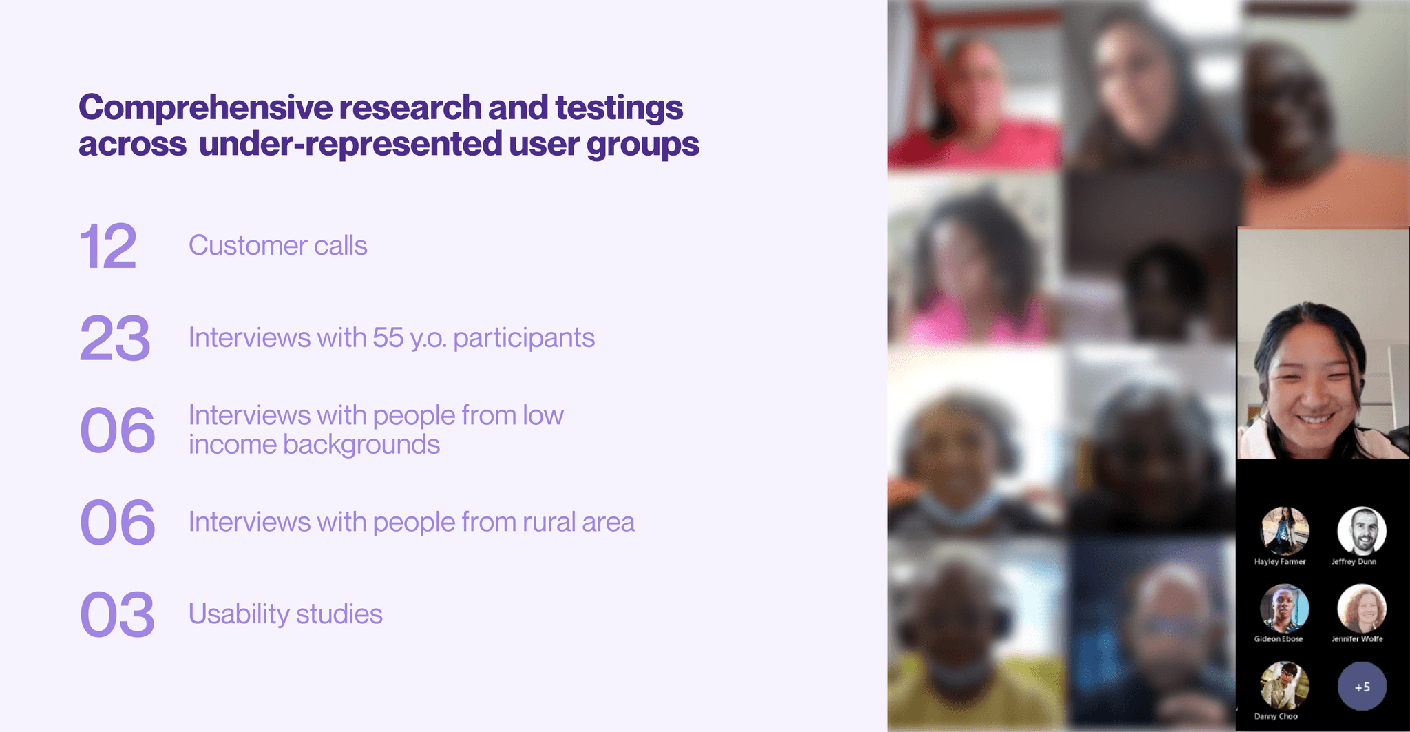
I began to deep dive into the problem space by talking with multiple healthcare customers. From initial customer calls, we learnt that while anyone can be a patient using virtual appointments, the majority include seniors, situationally disabled individuals, non-English speakers, those unfamiliar with technology, and those with low-income background — groups that often face additional barriers to accessing digital healthcare.
Inclusive research: bridging the gap for underrepresented users
Recognizing that the majority of attendees come from underrepresented groups, we set out to conduct user research that intentionally included these participants. This ensured that our design solutions were accessible, user-friendly, and catered to the needs of all patients, regardless of their technical proficiency.

What did patients say
"I feel like I don't have a general direction on how this appointment is going to happen" "
"…not sure where I'm, why I'm waiting, how long I'll wait…always worried if they forgot about me…"
"I'm never comfortable going to the doctor… and this waiting just making me feel even more nervous…"
synthesize findings
Mapping pain points along user journey
With all the research findings, I conducted an audit of the current virtual appointment experience, mapping out user emotions, pain points, consequences, and opportunities at each step.
Key pain points:
Technical barriers for underrepresented user group – Microsoft Teams was originally designed for B2B scenarios, catering to tech-savvy information workers rather than patients with varying levels of digital literacy. Currently, users must download Teams and create a Microsoft account to join meetings, which is particularly challenging for those unfamiliar with technology.
Limited access for users without computers or email – Many patients lack a computer or email, yet the system relies on email confirmations and prioritizes desktop use, making it inaccessible.
Long wait times without status updates – Without clear status updates, many patients assumed something was wrong and navigated away before their provider arrived, leading to missed appointments and frustration for both patients and providers.
No easy access to help – Unlike physical waiting rooms, virtual appointments offer no simple way for patients to get assistance when needed.
The old joining experience
scroll to see more ↔
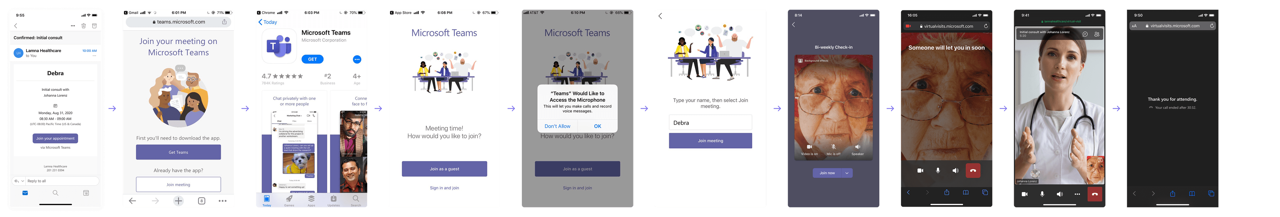
User journey

Zoom into the virtual waiting room problem
Physical waiting room


Guided by clinic staff and signs
Rich context
Easy access to help
Might be crowded but feel in control
Virtual waiting room


No clear guidance on what to expect
Little context in the generic waiting room
Not accessible to help and feel disconnected
Feel anxious and out of control
Job-to-be-done

Hypothesis
Providing rich context and relevant to users in waiting room can help them keep informed, confident and take control of their time
In collaboration with another designer who was working on scheduler & provider experience, we hosted a design workshop to rapidly ideate possible solutions from diverse perspectives. Then we broke out into smaller group to jam on the experience mapping and lo-fi storyboarding for the top voted ideas.
Together, we generated ideas around four key themes:
Providing rich context to keep users informed: queue progress, wait time countdown, video about what to expect, etc.
Offering relevant actions to make more efficient use of users' time: call-back service, checklist, relevant forms to sign, entertainment, etc.
Enable user to get help easily: FAQ, chat with schedulers
Enhancing personalization: branding, lounge music, animation to create a more welcoming experience

initial design
A context-rich waiting room with relevant actions and easy access to help
I explored various waiting room concepts based on our brainstorming sessions, prioritizing mobile design since most users access virtual appointments via phone rather than a computer. Starting with low-fidelity designs to define the high-level concept and information architecture, I iterated towards high-fidelity prototypes for user testing, ensuring the visual experience was accurately assessed.
Through close collaboration with my team, we landed on a version that:
Provide rich context: welcome message, wait status, doctor information
Offer relevant actions: text-back service, to-do list, educational content and meditation exercise
Enable easy access to help: direct chat with schedulers
Initial design for user testing

User testing
From assumption to reality: users need simplicity, not information overload
While customers appreciated the design solution, user testing uncovered gaps between our assumptions and actual user needs. Here are the key takeaways.
🍃 Prefer a simple & calm waiting experience
Participants, especially seniors, felt overwhelmed by excessive information in the proposed design. They preferred a calm, minimal interface with only the essentials to feel reassured. The most important elements were:
A clear welcome message explaining what’s happening
Doctor image & name that makes them feel personal and confident they are at the right place
Easy access to chat for support
🕹️ Varied engagement preferences across age groups
Senior users hesitate to interact – They fear that clicking on forms or engaging with educational content might take them out of the queue and cause them to lose their appointment.
Younger users value multi-tasking – They appreciate having the option to complete tasks while waiting, preferring control over their time.
👂 Seek non-visual signal to indicate waiting status
Since wait times are unpredictable—ranging from 5 to 15 minutes—users often prefer to multitask while waiting. To keep them reassured without requiring constant screen attention, audio or tactile signals (such as a chime or vibration) can indicate:
Confirmation that they are still waiting
The provider's arrival
💚 Desire to feel personal and connected
Seeing a doctor is always uncomfortable and nervous. Patients desire to feel personal, cared and connected with the care team.
Design Principles
Prioritizing simplicity with a sense of calm
The user testings result help us establish four key design principles to guide our design decisions, ensuring a seamless and patient-friendly virtual appointment experience.

Design iterations
scroll to see more ↔

Final design

Design highlight
Simple & personal waiting experience with the most important context
User testings revealed that the most important context for patients while waiting are:
High-level message about what's happening and what to expect
Health provider details
Appointment information


Design highlight
Chat with care team and get help easily
Chat is perceived to be the most important action item by users. The chat panel only cover 50% of the screen to help users, especially senior users, to feel reassured that they are still in the waiting room.
Design highlight
Balance simplicity and personalized content
Optional engagement – User can swipe up or tap to access more content while wait
Persistent waiting indicator – A status bar at the top reassures users that their appointment is still in progress
Visual-First Approach – Prioritize images over text for effortless information consumption.
On-Demand Learning – Allow users to receive detailed articles via SMS if they want to explore more.
Familiar Interactions – Enable simple taps to switch between content, mirroring social media navigation patterns.


Design highlight
Waiting sound indicator
In collaboration with a sound designer, we wanted to create subtle sound design for the waiting scenario:
Ambient waiting that ensure users their wait is still in progress and the page is not frozen.
A sound that indicate the meeting is about to start. So that users can be informed even not looking at their phone.
The new E2E experience
scroll to see more ↔

Outcome
A more accessible & effective virtual care experiences for patients and a more streamlined & efficient workflow for providers.
MVP released in Jan 2022
Improved usability and accessibility based on user testing & customer feedback
Established relationship with partner teams
Presented on XC All Hands
26%
Reduction in appointment no-show rates (3 months)
$509k
Saved using Virtual Appointments (18 months)
Source: internal telemetry. External reports (link).
What did patients say in user testing
“This is very simple... a lot better than my previous visit experience.”
"I wished I have used this experience for my visit."
Outcome
Virtual Appointments was scaled beyond healthcare to financial services, retail, virtual court and HR.


Discover other projects

Microsoft Viva | Horizontal Admin Center
Apple | New-hire onboarding platform